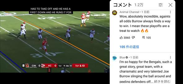
New UI (Pixel 6 Pro) of the YouTube app

The user interface of the full -screen display of the Android and iOS version of YouTube application has been improved, making it possible to evaluate and display comments with full screen display.According to THE VERGE, it has been rolled out since January 31.In the entry of the writer in the comment section, the Android device is already a new UI, but the iOS terminal is not yet.Until now, the YouTube app has been evaluated with the full -screen display with the terminal sideways ("highly evaluated" or "low evaluation" in the icon holding the thumb or the thumb down).It was necessary to tap the video, swipe the screen from the bottom and display the icon, and in that state the video was hidden.In the new UI, if you tap the video being played, the evaluation icon will be displayed at the bottom left of the screen, and you can evaluate while watching the video by tapping it.In addition, a new comment icon is displayed on the right, and when this is tapped, the comment section is displayed while playing the video, and you can enter your comments.
ITMEDIA NEWS